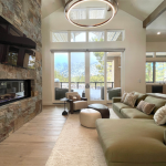
Ask Talie Jane: How do I determine a color palette for my home?
Welcome back to Ask Talie Jane! I’m Talie, your design insider and go-to guide for spaces that truly work.
Today’s sizzling question: How do I determine a color palette for my home?
· Jan S. Zephyr Cove
Great question, Jan, and one I hear all the time.
Color is one of the most powerful tools in interior design. It sets the mood, expresses personality, and creates a sense of flow from room to room.
Whether you’re craving a calm retreat, a lively place to gather, or a cohesive whole-home look, the right color palette makes all the difference. While choosing colors can feel overwhelming at first, understanding a few designer-approved color schemes turns the process into something fun and empowering.
Color should inspire confidence and creativity. Let’s break down the core color schemes designers rely on every day and how you can use them at home.
Monochromatic palettes are built around one color in varying shades and textures. Picture soft ivory walls layered with warm creams and deeper beige accents. This approach feels serene, timeless, and effortlessly pulled together, perfect for bedrooms, bathrooms, or minimalist spaces.
Analogous palettes use colors that sit next to each other on the color wheel, such as blue, blue-green, and green. These combinations feel natural and layered, making them ideal for open-concept homes. A space with sage walls, muted blue upholstery, and warm wood tones feels both fresh and grounded.
Complementary palettes pair colors opposite each other on the color wheel, like navy and rust or blush and green. These combinations bring energy and contrast, making them great for dining rooms or creative spaces. The secret? Let one color lead and use the other as a supporting accent.
Triadic palettes involve three evenly spaced colors on the color wheel, often softened into more livable hues. When used thoughtfully, this scheme adds personality and playfulness without overwhelming a space.
For many homeowners, a neutral foundation with accent colors offers the most flexibility. Timeless whites, taupes, and warm grays set the stage, while accent colors shine through pillows, art, and accessories that can evolve over time.
When building a whole-home palette, start with one anchor color you love and repeat it subtly throughout. Consider natural light, flooring, and existing finishes, they all influence how color appears. Most importantly, trust how a color makes you feel. The best palette isn’t just beautiful, it feels like home.
Have a design or construction question? Send it to Natalie@TalieJaneInteriors.com, and you might see it answered right here in the next column.
Talie Jane is the Owner and Principal Designer of Talie Jane Interiors, an award-winning, full-service design firm serving the Lake Tahoe and Napa/Sonoma regions. She is also the co-owner of Talie Jane Construction, a design-driven general contracting firm specializing in luxury remodels.

Support Local Journalism

Support Local Journalism
Readers around the Lake Tahoe Basin and beyond make the Tahoe Tribune's work possible. Your financial contribution supports our efforts to deliver quality, locally relevant journalism.
Now more than ever, your support is critical to help us keep our community informed about the evolving coronavirus pandemic and the impact it is having locally. Every contribution, however large or small, will make a difference.
Your donation will help us continue to cover COVID-19 and our other vital local news.


